Nadio Studio

Every studio needs to practice what it preaches. Nadio's own brand identity was designed with the same process and standards we bring to every client — no shortcuts because it's "just ours."
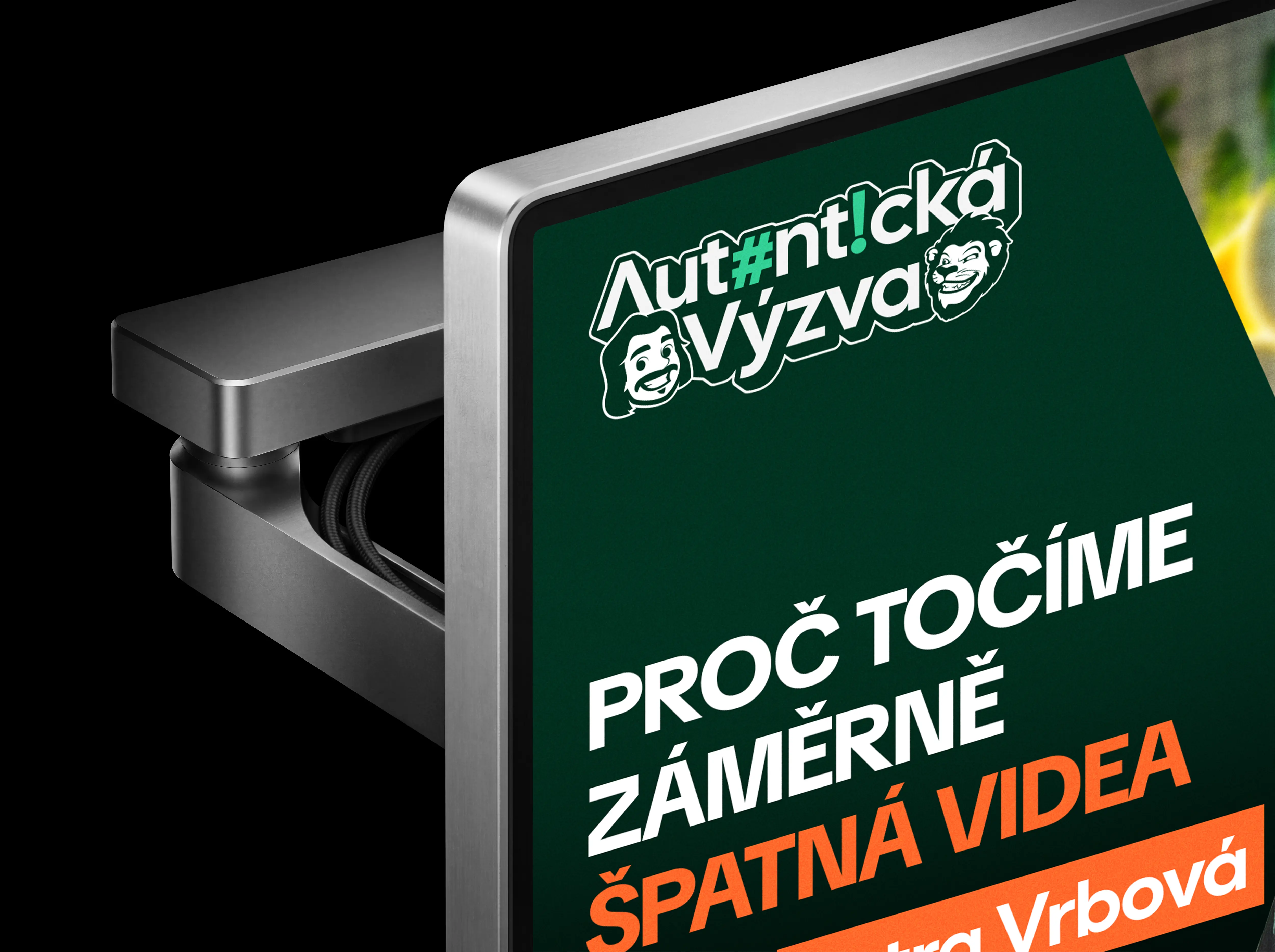
The goal was simple: build a visual system that communicates clarity, craft, and a bit of personality — and works just as well on a billboard as on a browser tab.
Client
Self Branding
Year
2025
Services
Visual Identity
Graphic Design
Motion Design
UX/UI Design


The Nadio identity spans logo, typography, color system, branded merchandise, outdoor advertising, website design, and motion. We treated ourselves as our own most demanding client — because if our own brand doesn't hold up, why would anyone trust us with theirs?